← All projects
Modus Mobility
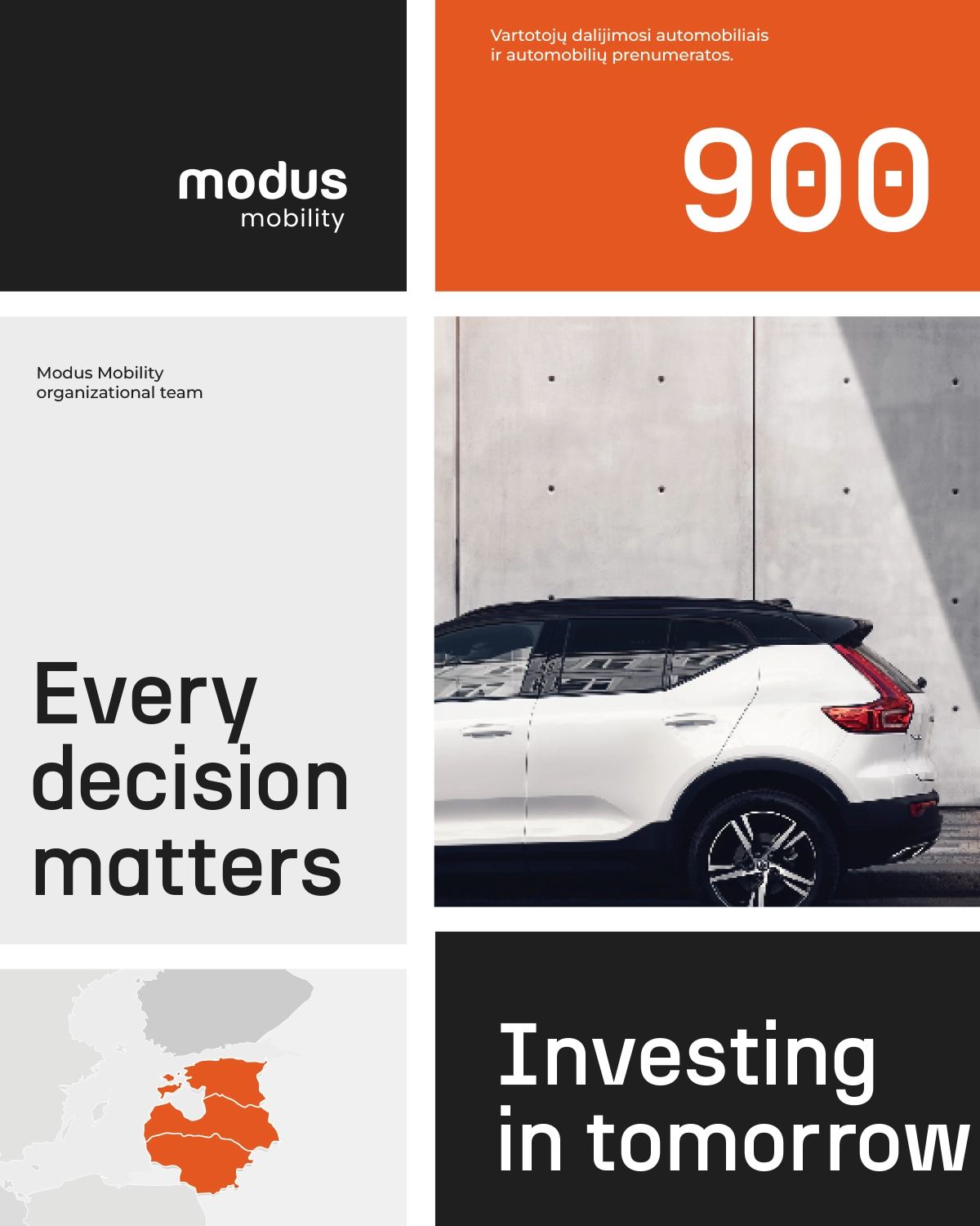
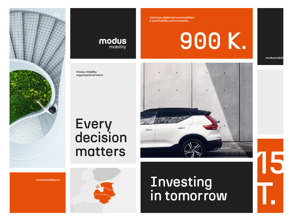
A proposed visual direction for a sustainable mobility company, built around a bold orange and clear messages.
Year
2022
Website
Visit ↗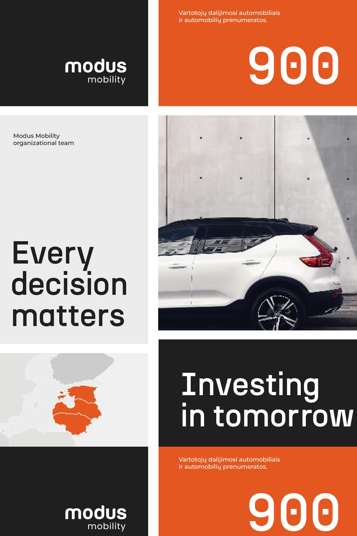
Challenge
Modus Mobility is a sustainable mobility company in Lithuania. The brand had existed for some time but had no clear visual direction. While working at the company, I was tasked with creating one. This is one of the directions I prepared; it wasn’t chosen in the end, but it shows well how the brand could have looked.Solution
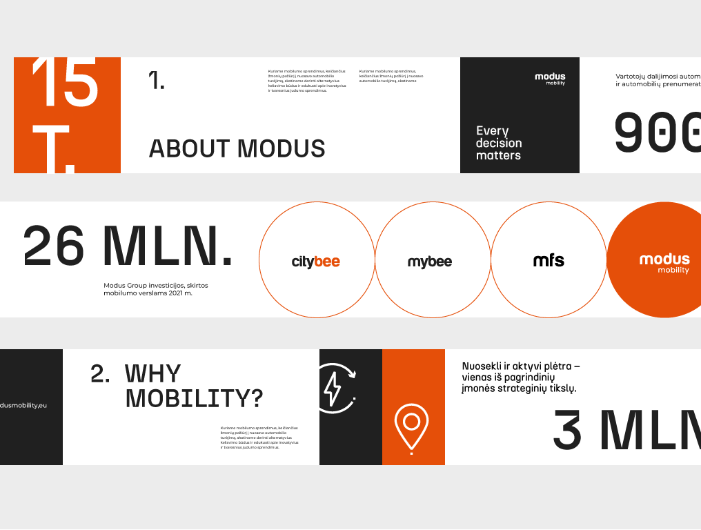
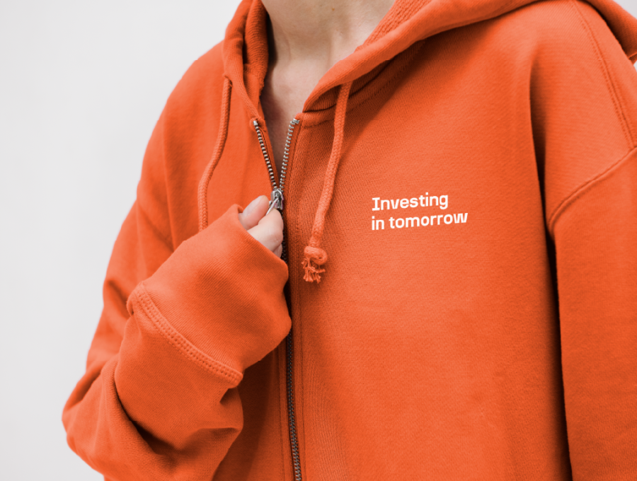
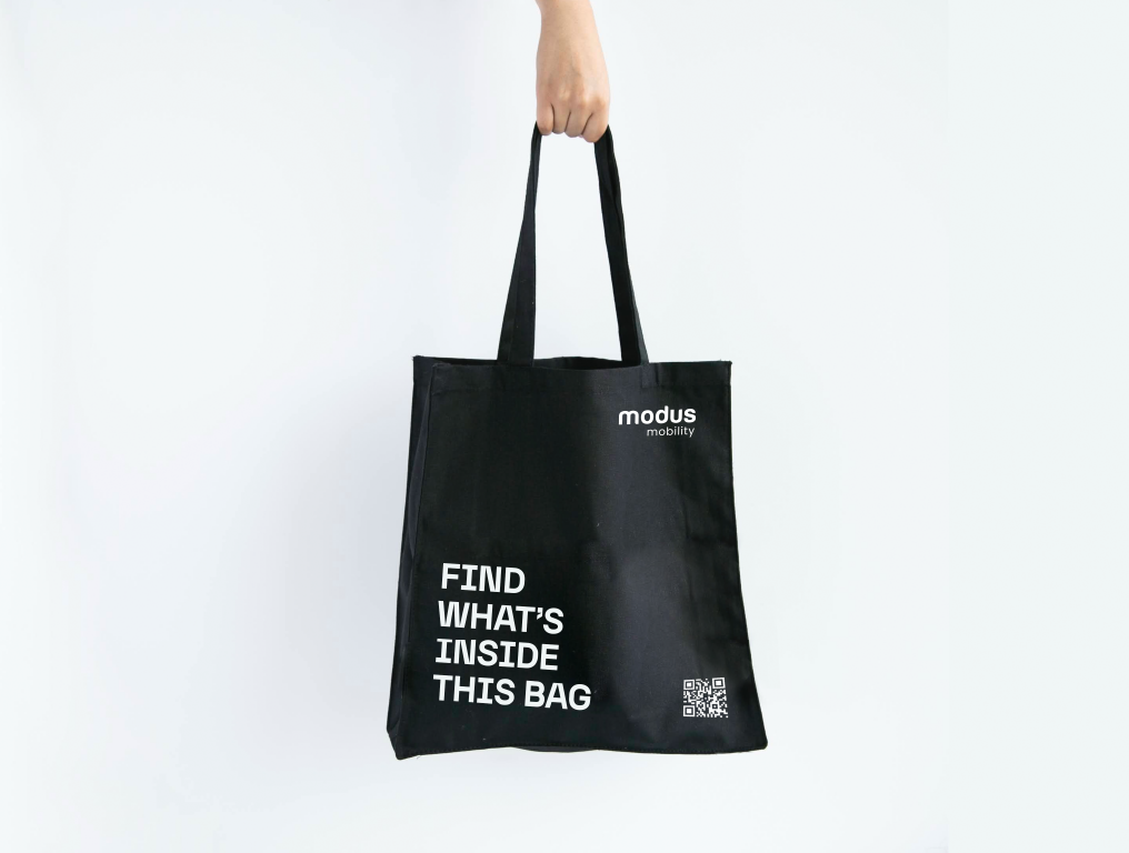
- Bold orange. A daring orange becomes the main recognition mark and sets the brand apart from the restrained companies in the mobility sector.
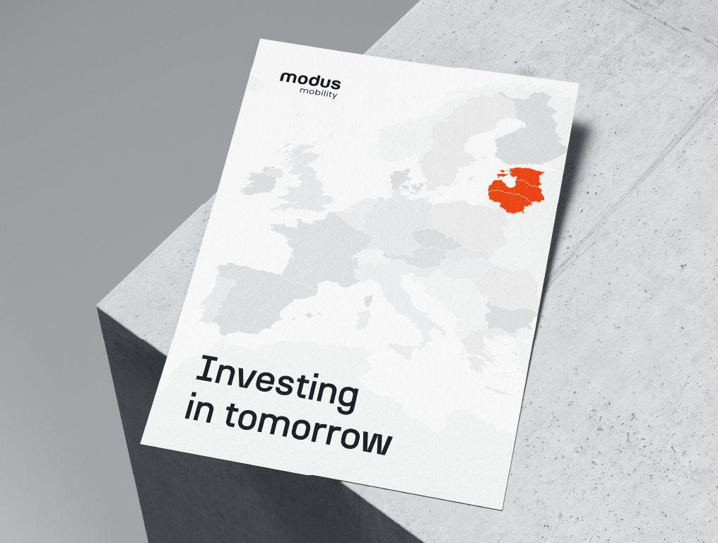
- Clear messages. I wrote short taglines, “Every decision matters” and “Investing in tomorrow”, that convey the values of sustainability.
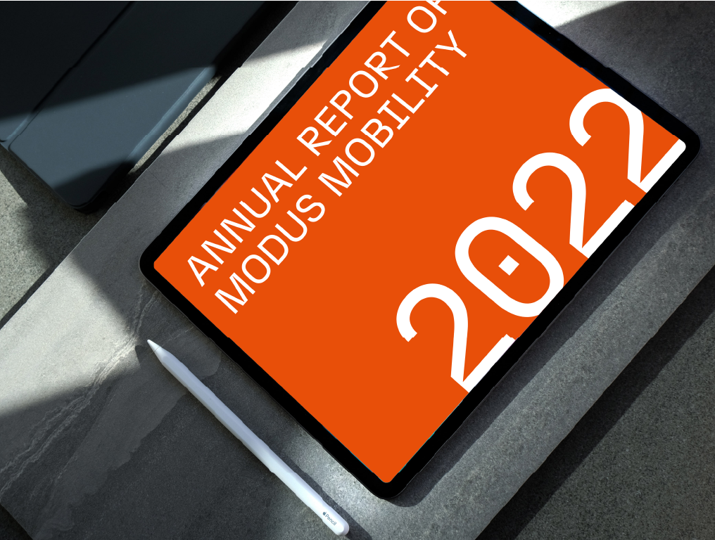
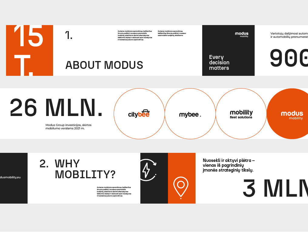
- Templates. I prepared presentation and report templates so all of the company’s documents look consistent.
- Merchandise. I applied the identity to hoodies, bags and other merchandise.
- Brand book. I brought all the rules together in a brand book so the direction is easy to apply.
Result
The direction was created in 2022. Although it wasn’t chosen, the project shows how a single bold colour and a few clear messages can give an existing brand a vivid character.Testimonial
More projects
All projects →
Artami
Art never stands still, and neither does the Artami logo. Solid letters lean into motion, while bold colours make sure no one walks past.
View project → Visit website ↗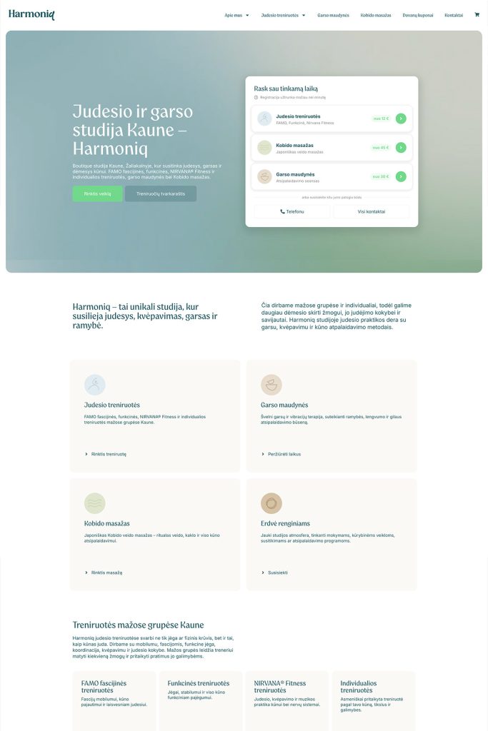
Harmoniq
Small groups, plenty of attention. A logo and website for a boutique movement and sound studio in Kaunas.
View project → Visit website ↗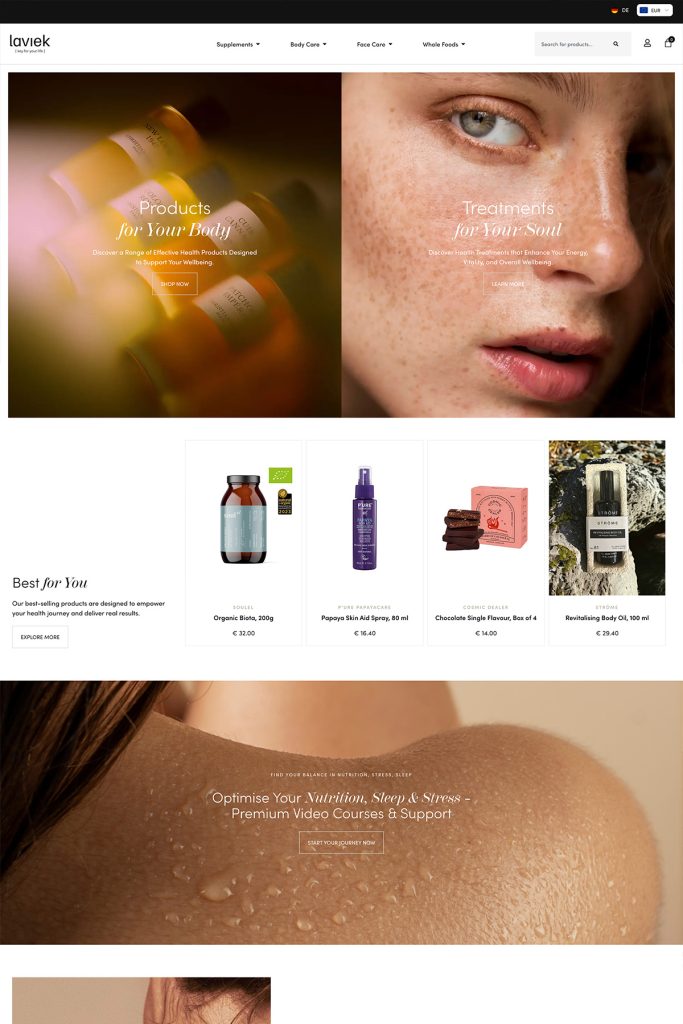
Laviek
An elegant, bilingual online store for a nutrition and wellness specialist building her brand in the Swiss market.
View project → Visit website ↗Want a similar result? Let's talk about your project.
I'll reply within 1–2 business days.