← All projects
Artami
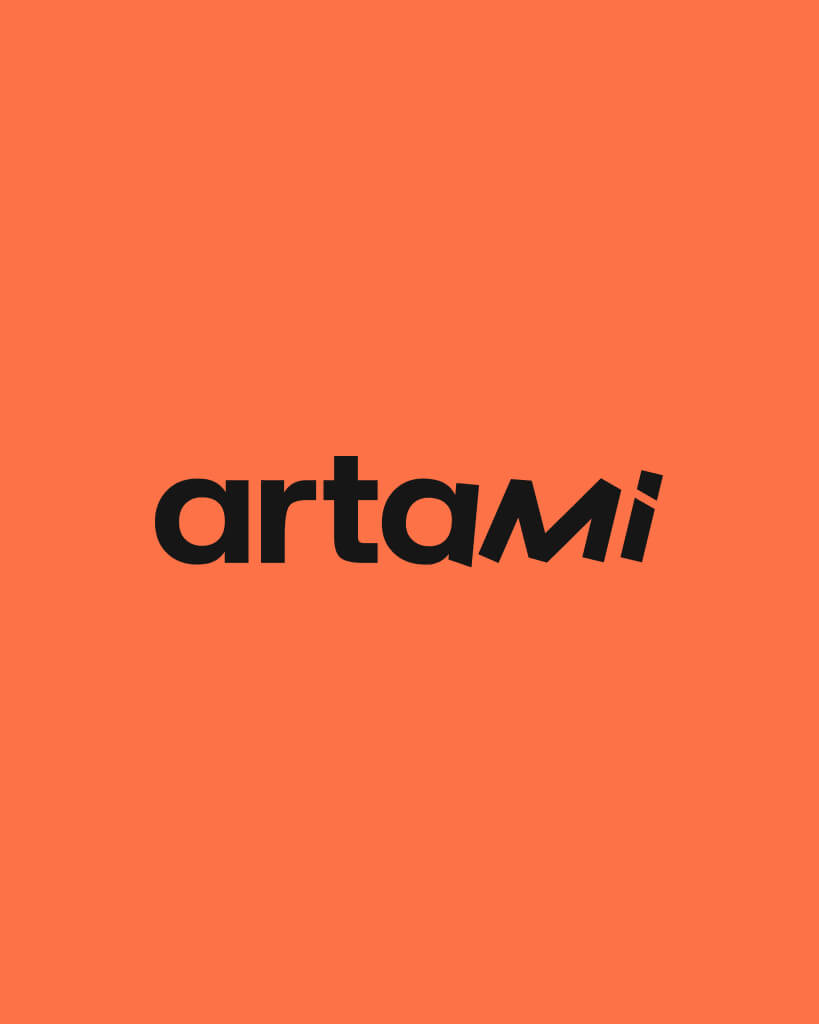
Art never stands still, and neither does the Artami logo. Solid letters lean into motion, while bold colours make sure no one walks past.
Year
2025
Website
Visit ↗
Challenge
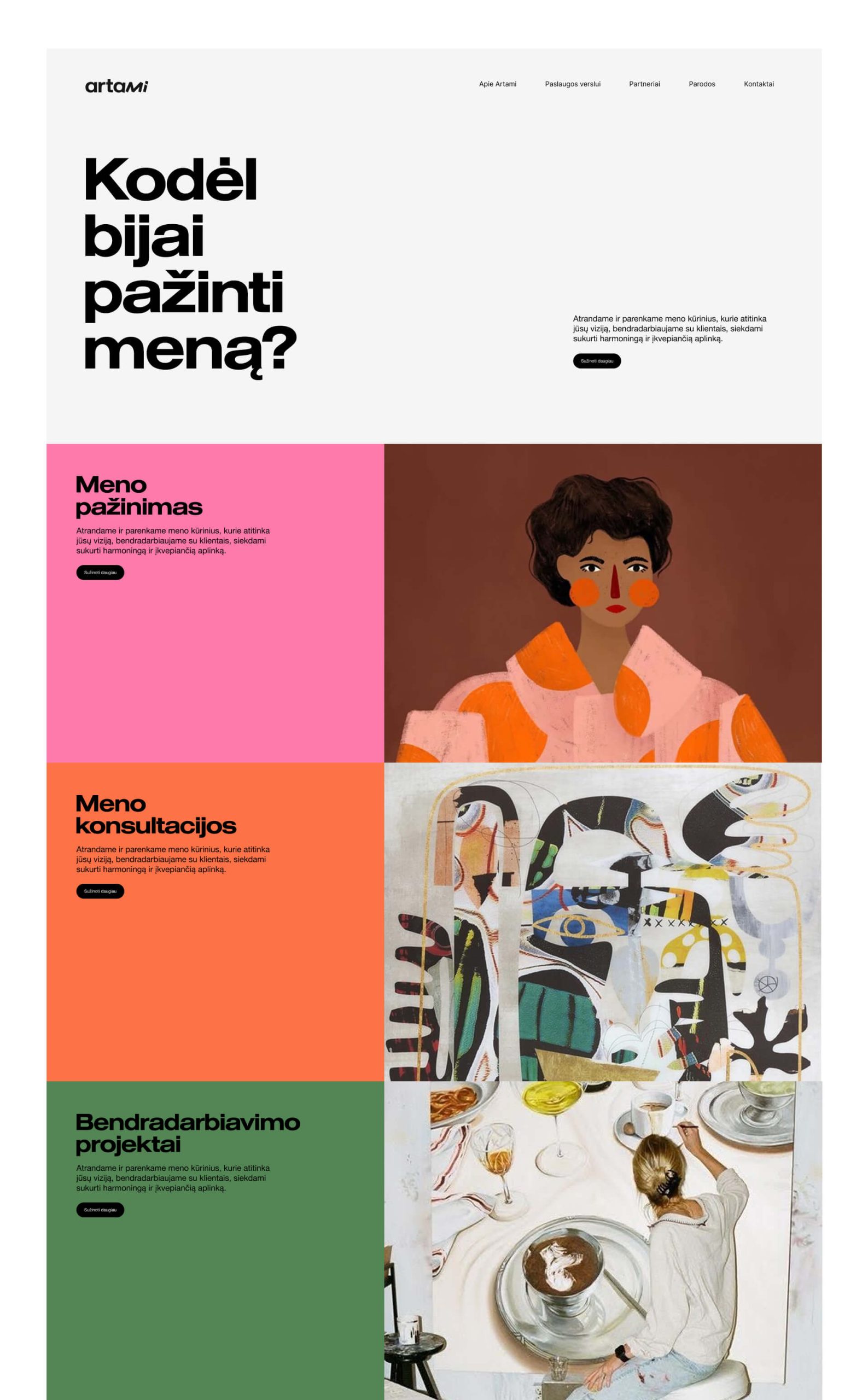
The founder of Artami is an art expert with many years of experience and a wide network in the art community. She decided to build on that experience by founding Artami, an art and science agency, but there was no brand yet, only a name. The agency works in three areas, and each one asks something different of the identity:- Art consulting helps clients find and place artworks in private and business spaces, so here the agency has to feel trustworthy yet contemporary and dynamic.
- Collaboration projects cover business and art partnerships, pop-up exhibitions and art rental, which calls for flexibility and the ability to adapt to different needs.
- Art education calls for intelligence and distinction.
Solution
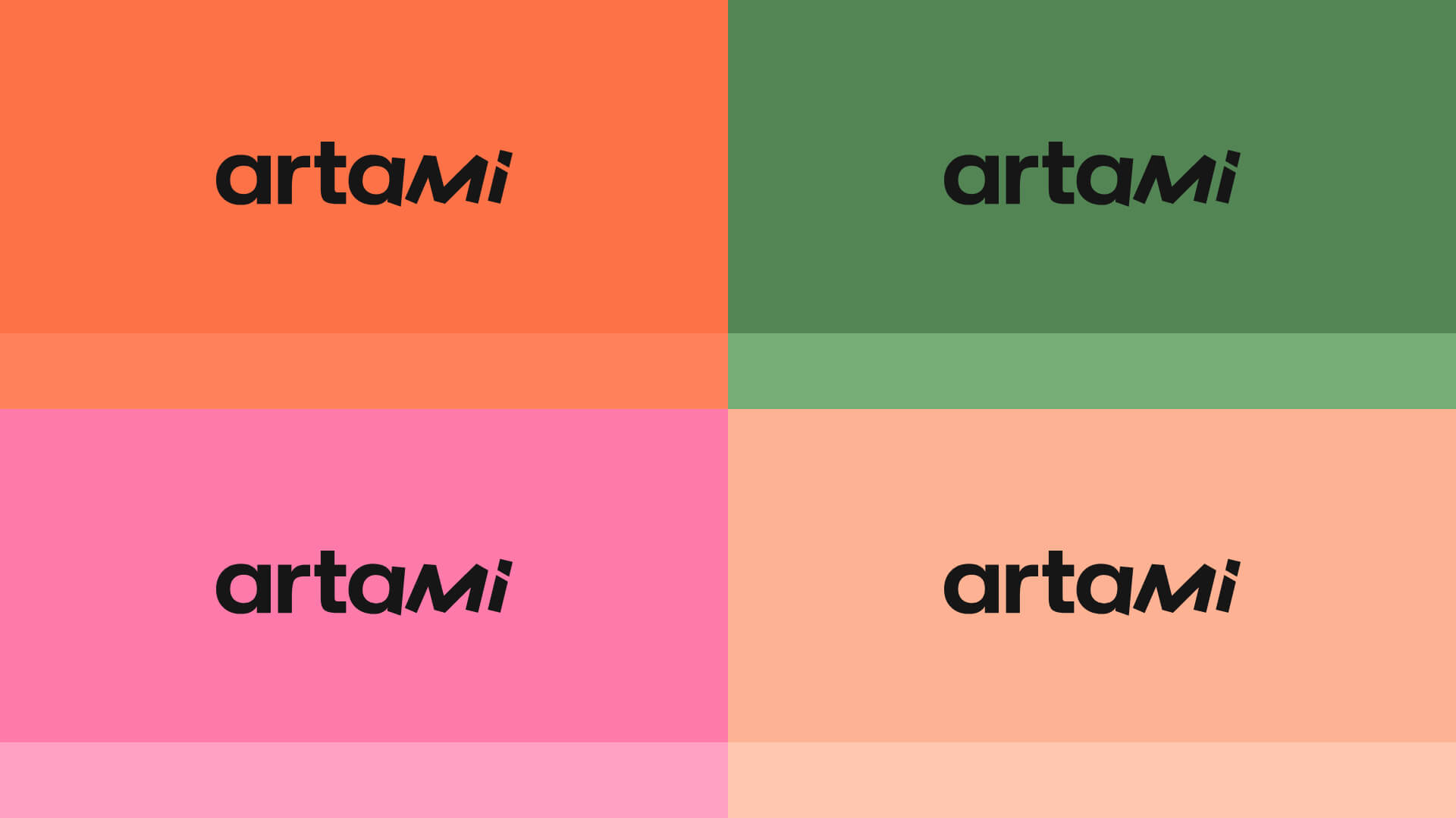
- Letters that move. The logo starts in a solid bold typeface that stands for authority and reliability, which matters when working with private clients, interior designers and companies. Towards the end the letters lean and motion appears, a reminder that art brings a space to life.
- Two styles in one whole. The change of typeface within a single word reflects what the agency itself does: it brings different styles of art and design together into a harmonious whole.
- A hint for the attentive. The logo subtly hides a hint about how to pronounce the name. It’s a small detail, but details like this show the agency’s intelligence.
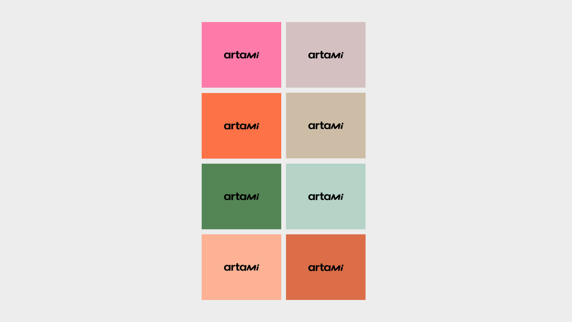
- Bold colours. The art world often chooses restraint, so bright blocks of colour set Artami apart straight away, spark emotion and are easy to remember.
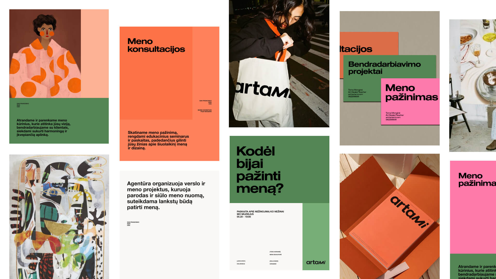
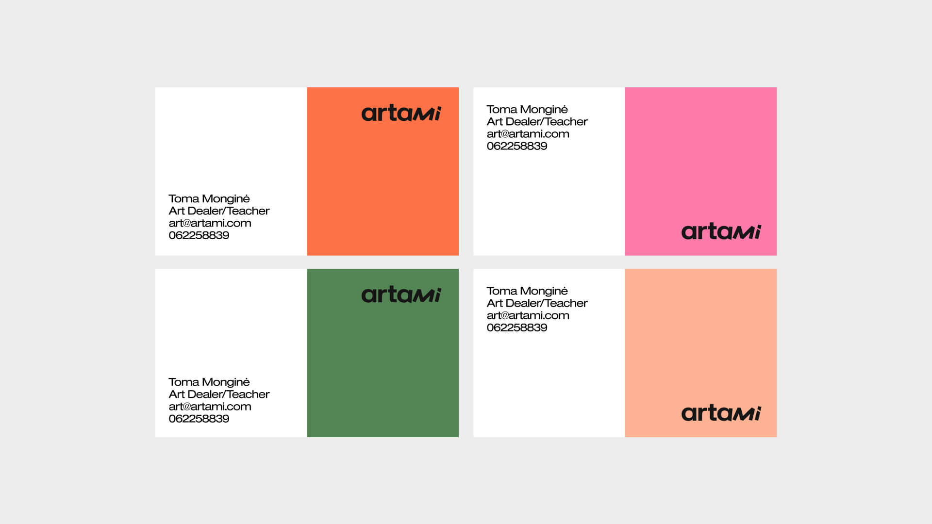
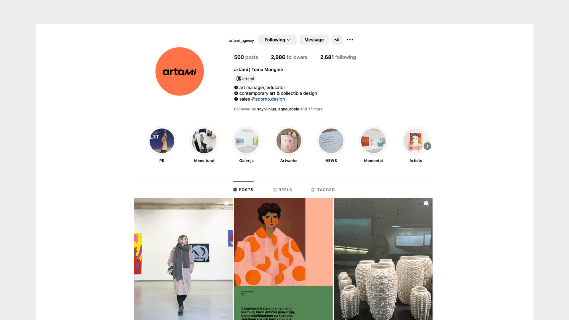
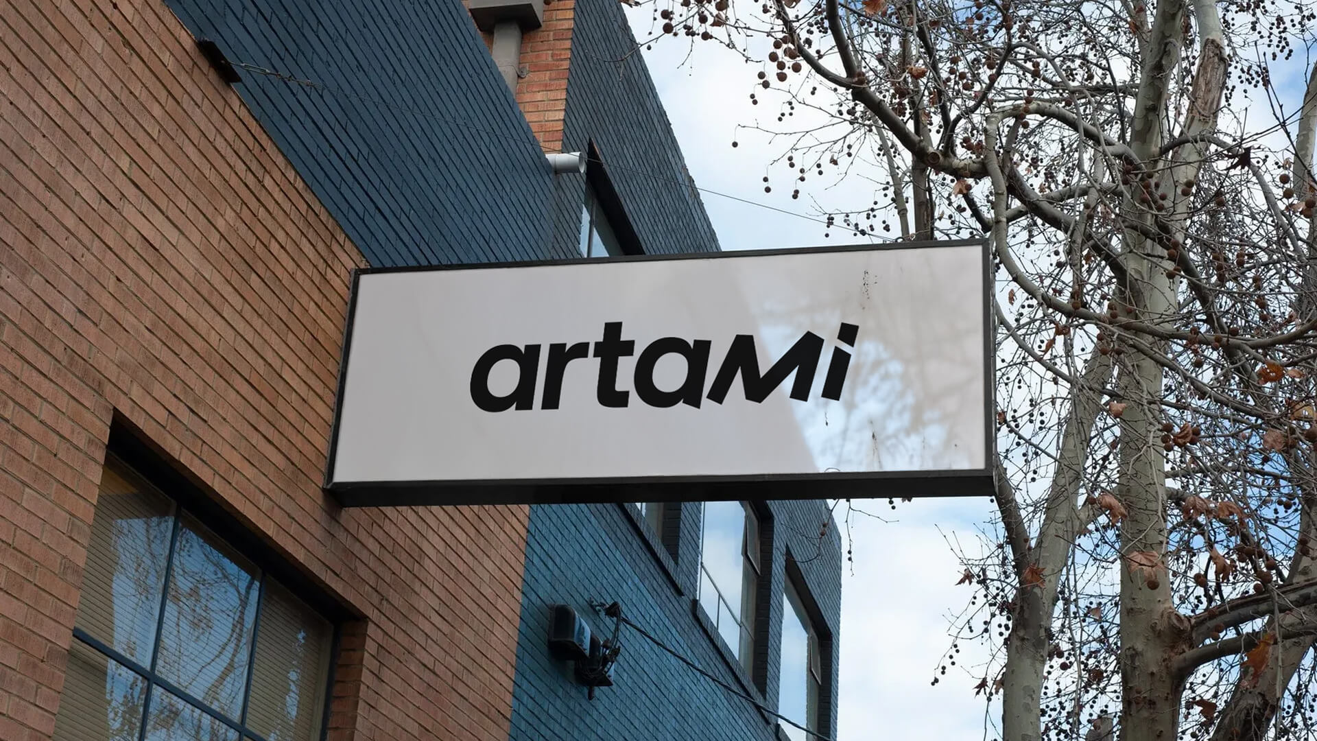
- A complete system. Alongside the logo I created a colour palette, typography, a layout grid, social media templates, business cards and signage, so the identity looks consistent everywhere.
Result
The project took two months and was completed in 2025. I presented a single concept to the client, and one was enough, because we had refined the direction together before the first sketch, through a questionnaire and a choice of style directions. Today Artami speaks with one recognisable voice across every channel, from an Instagram post to the sign on the door.Testimonial
More projects
All projects →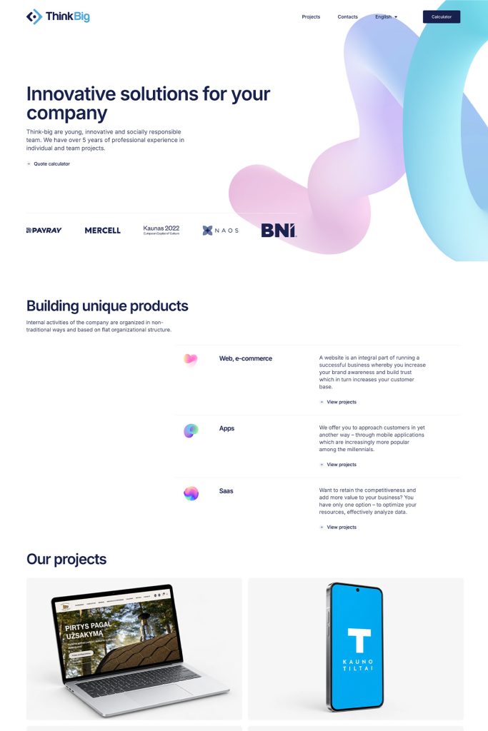
Think-big
A modern, bilingual website for a digital agency that builds technology itself and needs to look the part.
View project → Visit website ↗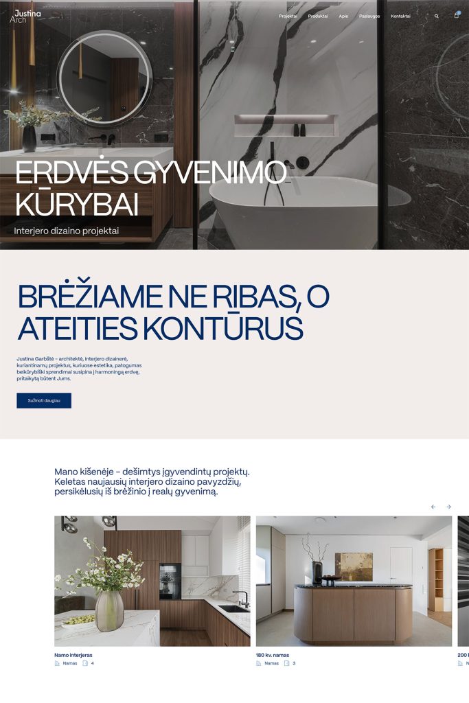
Justina Arch
A minimalist portfolio website and online store for an interior designer, where her work takes centre stage.
View project → Visit website ↗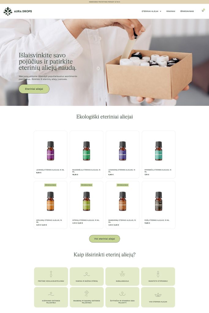
Aura Drops
An online store for a family business selling essential oils, which not only sells but also explains how to use the products.
View project → Visit website ↗Want a similar result? Let's talk about your project.
I'll reply within 1–2 business days.