← All projects
Curology
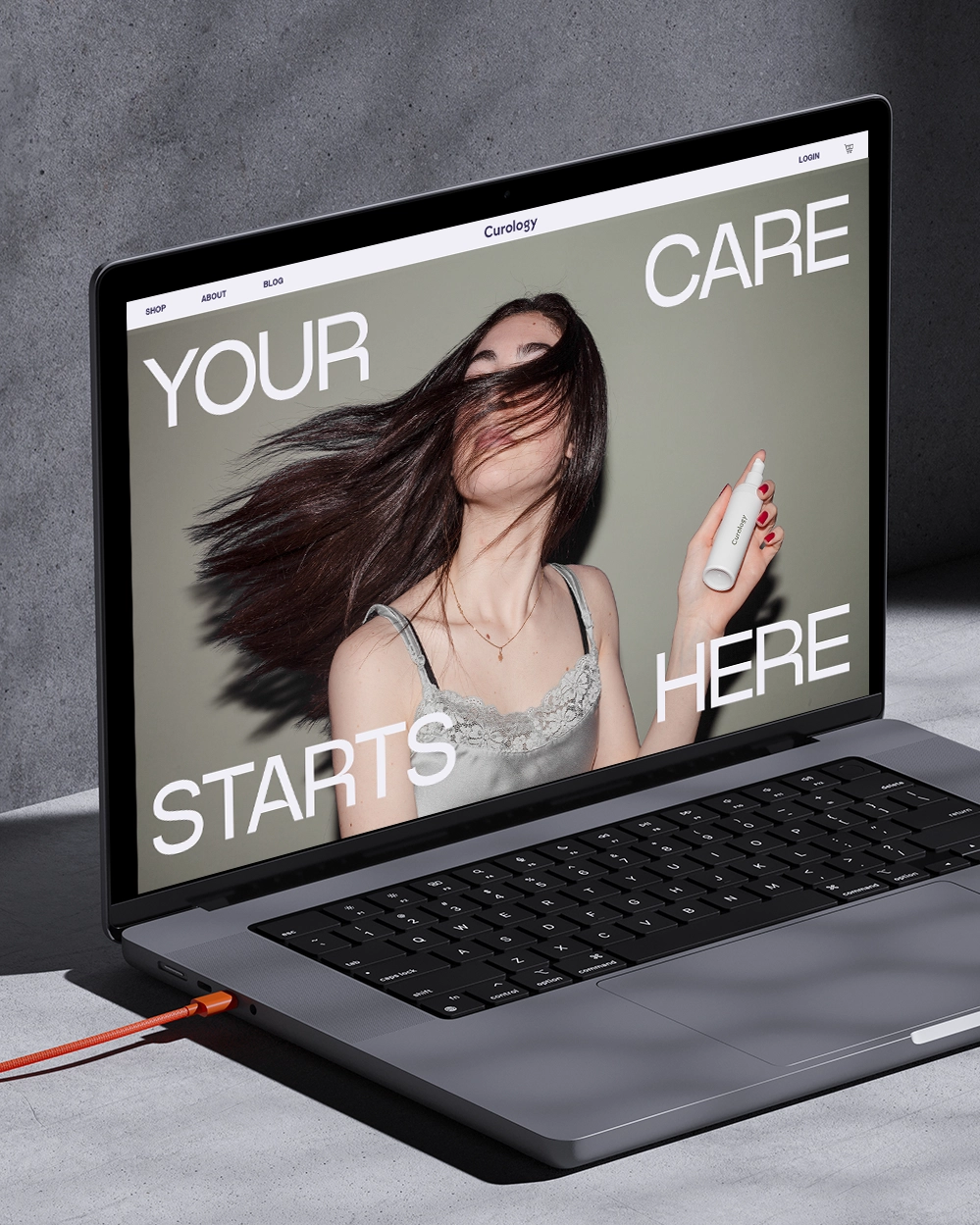
A concept website for a skincare brand, where contrasting photography and large typography take the leading role.
Year
2023
Website
Visit ↗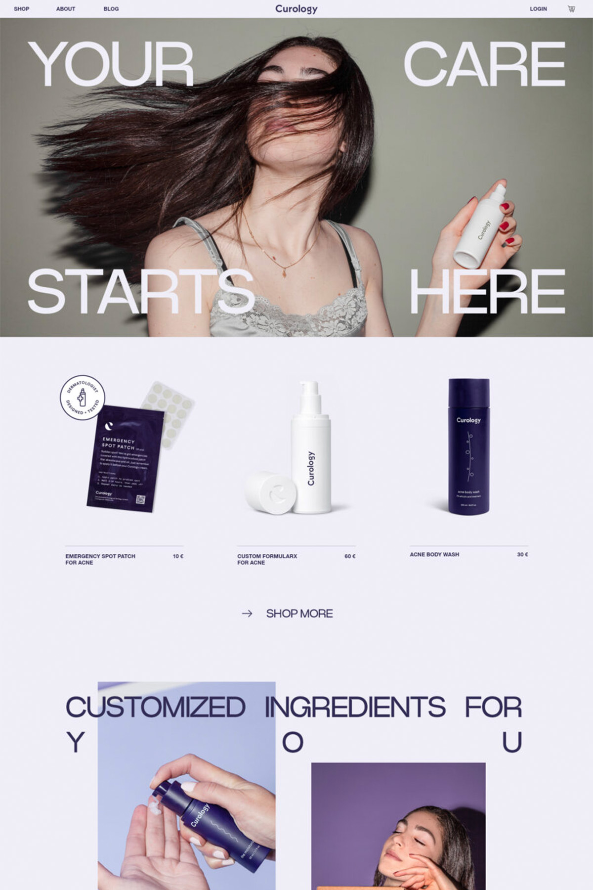
Challenge
This is a concept project I created on my own initiative, not a commission from Curology. Curology is a skincare brand that helps care for every skin type and tailors the routine to each person. The project was inspired by photos I found on Unsplash, and I wanted to see how a bold visual language could tell the brand’s story in a way that sparks interest and loyalty.Solution
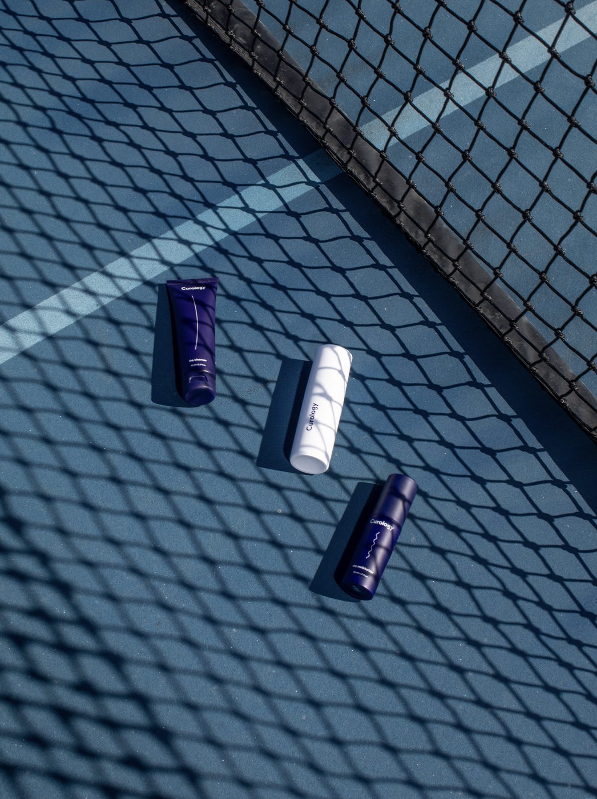
- Contrast. I combined high-contrast photos with a striking typeface, so every screen feels like a magazine spread.
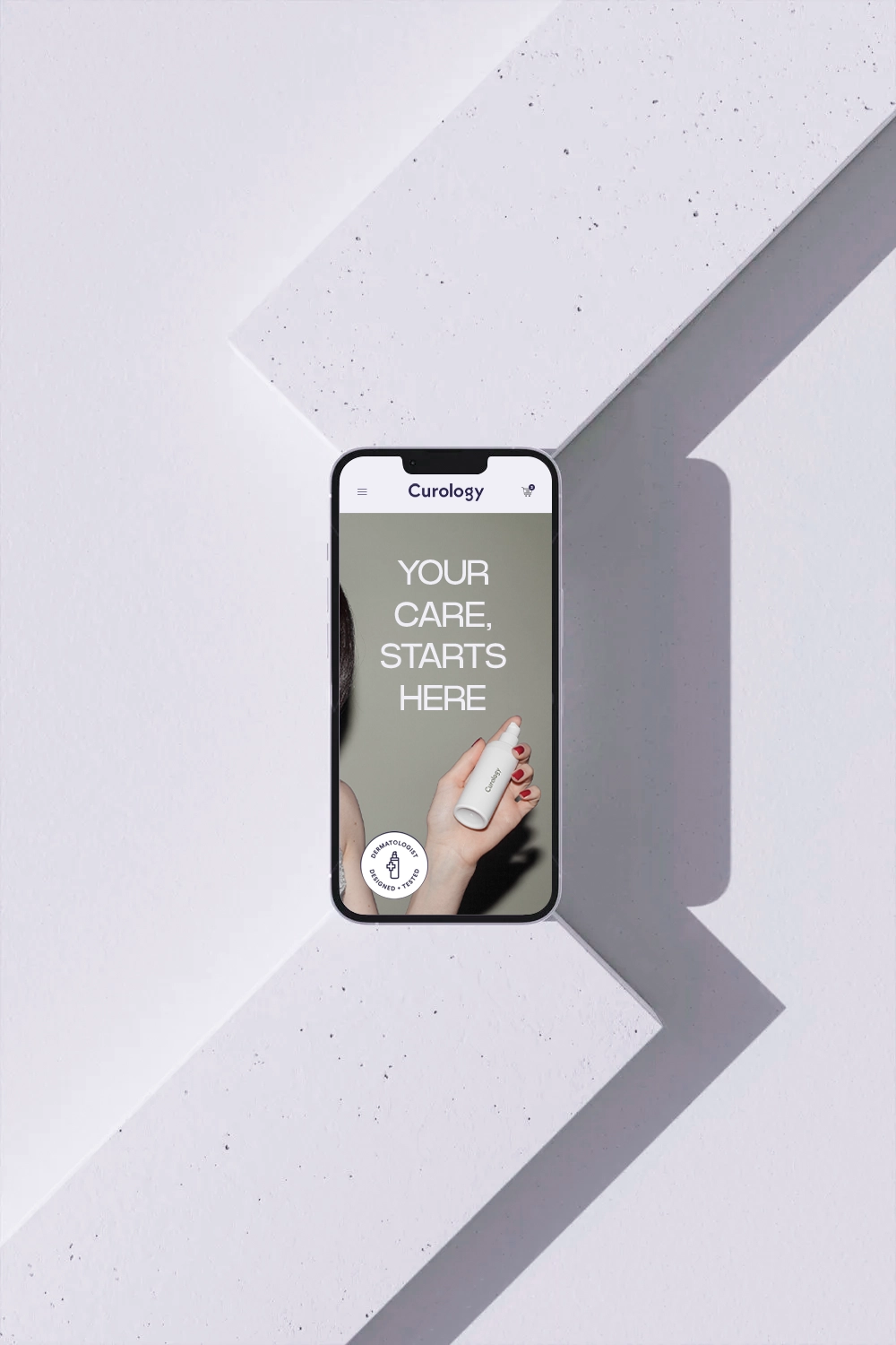
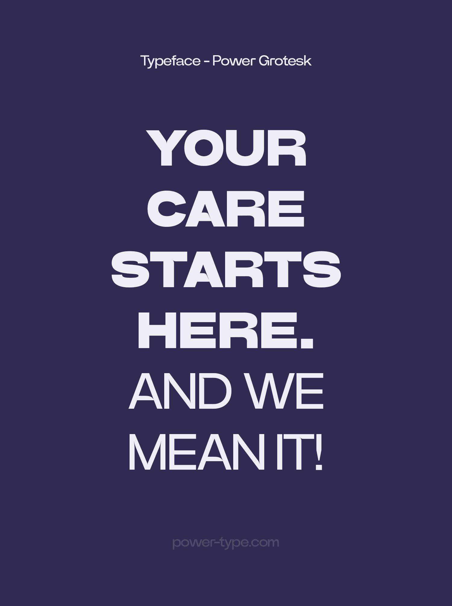
- Oversized typography. Large letters become the main design element and carry the brand’s messages, such as “Your care starts here”.
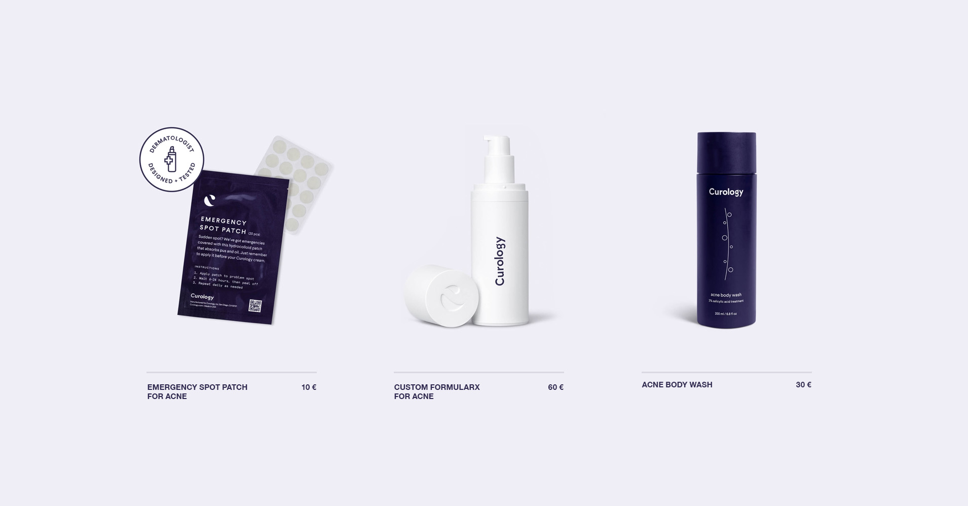
- Personalisation. The website structure emphasises that skincare is tailored to each individual.
- Scope. I created a design concept for the home page and the main pages.
Result
The concept was created in two weeks in 2023. The project was a chance to try a bolder, editorial visual language and show how typography can become the main design element.Testimonial
More projects
All projects →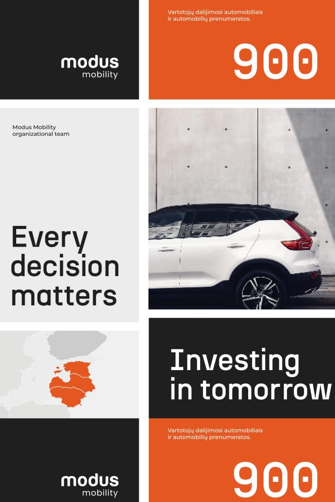
Modus Mobility
A proposed visual direction for a sustainable mobility company, built around a bold orange and clear messages.
View project → Visit website ↗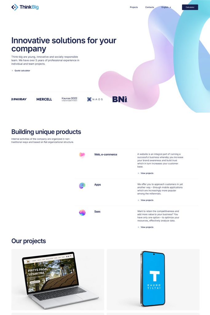
Think-big
A modern, bilingual website for a digital agency that builds technology itself and needs to look the part.
View project → Visit website ↗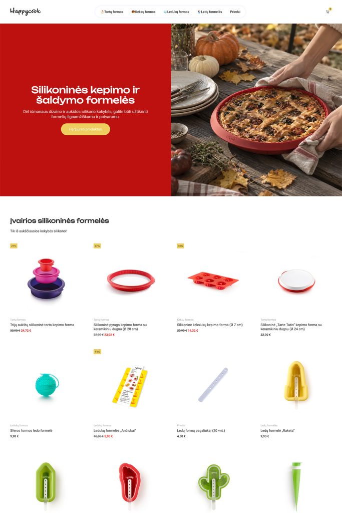
Happycook
A family online store and brand that brought the Spanish kitchenware brand Lékué to Lithuania.
View project → Visit website ↗Want a similar result? Let's talk about your project.
I'll reply within 1–2 business days.